
In plain words
Tailwind is a styling framework built from small fixed building blocks — a defined set of colours, spacing steps and type sizes that every page is assembled from, rather than each page inventing its own.


The styling system behind the look of your site: one set of colours, spacing and type, applied the same way on every screen and every device.
Tailwind is a styling framework built from small fixed building blocks — a defined set of colours, spacing steps and type sizes that every page is assembled from, rather than each page inventing its own.
Your brand stays consistent. A heading on the contact page is the same size as a heading on the services page, spacing is even, and the same rules hold from a wide monitor down to a phone.
It also keeps the site light: only the styles actually used are sent to the browser, so pages stay quick as the site grows.
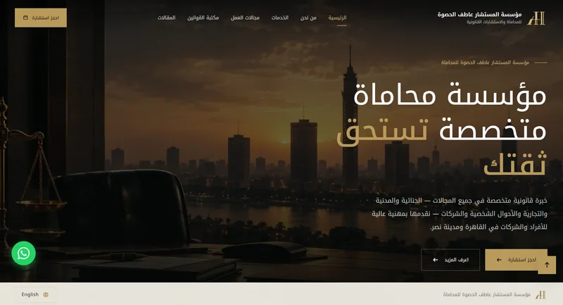 Law firmAl Hasswa Law FirmA law-firm web app that publishes the firm’s articles and legal guides and takes consultation bookings, built to rank for lawyer searches in Cairo.Read the case study →
 Physiotherapy clinicPhysioTech ClinicA physiotherapy clinic web app with online booking, plus a management system for doctors, patients, schedules, sessions, payments, services and packages.Read the case study →
 Appliances wholesale & retailUNIQUEA full ERP with an online store on top of it: products, stock, prices, customers and orders live in one system, in Arabic and English.Read the case study →
 AngularFront-end
 TypeScriptTooling
 Node.jsBack-end
 PostgreSQLDatabase
 SequelizeBack-end
 JWTSecurity
 SMTPIntegrations
 Helmet.jsSecurity
Tell us what your business needs. We'll build the system around it.
START A CONVERSATION →or email us at info@nilexdigitalsystems.com